Usage
User Interface
Semblage's user interface has several parts, and learning where they are and what they do will be important when starting with Semblage. The user interface is kept intentionally simple, and an effort will be made to keep it simple over time as more features are added. In most cases, hovering the mouse cursor over a control will show a tooltip with additional information about what the control does.
Below is a diagram showing the main sections of the user interface.
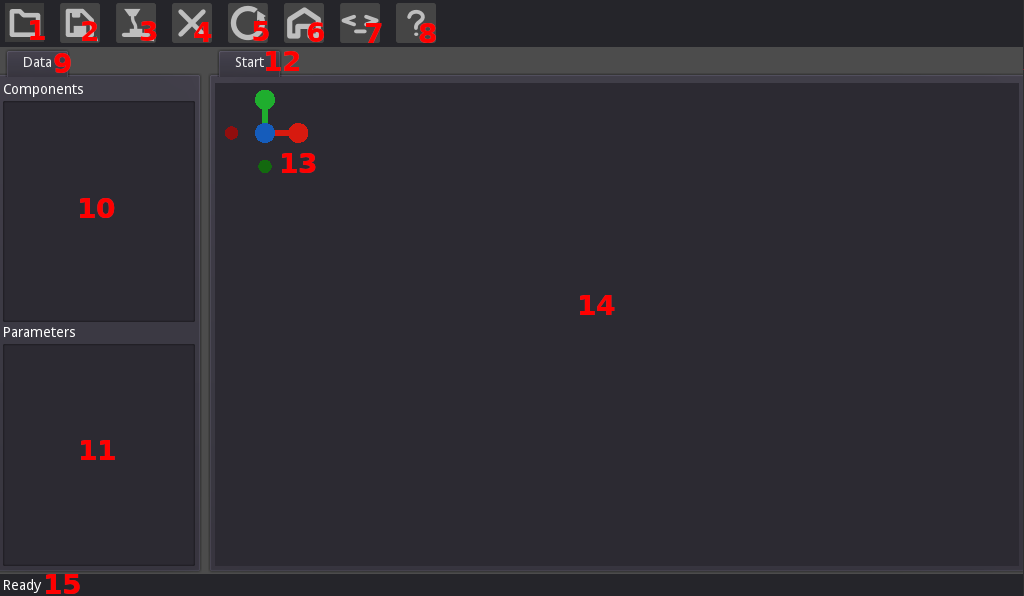
- Open Button - Allows a user to open a Semblage component file, which is just a carefully structured CadQuery script. Semblage files are structured in a way that preserves the history, which is the order that operations were added in. Opening a non-Semblage CadQuery file may still work, but is not officially supported at this time, and no history will be loaded. It should be understood that Semblage is not a CadQuery IDE. There are other editors like CQ-editor that can fill that role better than Semblage.
- Save Button - Any button with a triangle in the bottom-right corner will open a submenu. The Save button gives two options: Save and Save As. If a component has not been saved yet, clicking the Save item will trigger a Save As, which allows the path and file name to be set for the component. After the file name has been set, clicking Save will simply save the component to the existing file. The Ctrl+S hotkey combination will trigger a save as well.
- Export Button - Also referred to as the Make Button, the icon for this button is a 3D printer hotend which is extruding plastic. Clicking this button will display a submenu with a listing of each format that the component can be exported to. Clicking on one of the items will open the export dialog for that format.
- Close Button - Closes the current component and clears the UI so that work on a new component can be started.
- __Reload Button_ - Gives the user the option to manually reload the rendered view if the user interface does not do it automatically for some reason.
- Home Button - Clicking this button with a component loaded into the 3D view will return the camera view to a standard "home" position. This gives a safe spot to come back to when rotating, panning, and zooming an object.
- Show Code Button - This button shows the current underlying code that is being generated for the model. Useful for getting a feel for the CadQuery code that is being generated, and for copying it to a CadQuery editor such as CQ-editor for exploration and debugging purposes.
- Information Button - This button opens an About dialog that contains acknowledgements, documentation links, and version information.
- Data - Sidebar that contains the list of Components with the operation History of the associated component, and any Parameters that are associated with the current component. Parameters are global and are not scoped to any single component within the enclosing component script.
- Components - List of current components. Each component will contain all of the operations that have been added to it as children in the tree. Multiple components can be added and used in combination to perform operations such as sweep. Right clicking on a component gives a menu that allows a user to Add, Edit, Remove or Show/Hide the component, or change the component's Color/Alpha. Right clicking on an operation item shows a menu that allows a user to Add, Edit and Remove the operation, and there is also an item (Insert Above) that will allow an operation to be inserted above the operation that was right clicked on. Operation items can also be dragged and dropped onto one another to reorder the operations.
- Parameters - Parameters are what make a model "parametric", and this control holds any parameters that are defined for the current component. These parameters are global to the component script, and are not scoped to an individual component within the script/file. Right clicking in the empty space will give the user the option to add a New parameter, which will open the Add/Edit Parameter dialog. Once a parameter has been added, right clicking on it will enable the user to Edit or Remove that parameter. Double clicking an entry in this list also allows that entry to be edited, although the name of a parameter cannot be changed once it has been created. To change the name, the parameter must be deleted and recreated. Parameters can be dragged and dropped on top of each other to reorder them.
- Document Tab - Displays the path and name of the currently open component. Displays Start when the UI first loads.
- Rotation Indicator - Shows the X (red), Y (green) and Z (blue) axes and their orientation. This indicator mirrors the rotation applied to the 3D view. In the future the indicator ball for each axis will be labelled with its axis letter, and clicking on a ball will snap the 3D view to that orientation. This is very similar to the way this indicator works in Blender.
- 3D View - The 3D render of the component is displayed in this view. 2D geometry such as edges are also rendered into this 3D view. The mouse controls outlined below can be used to rotate, pan and zoom the 3D view.
- Status Indicator - Used to keep the user updated on what the UI is doing. Examples are Ready for when the interface is fully loaded and ready to use, Rendering... for when a component is being recomputed and prepared for display, and Component saved to indicate that a save operation completed.
Add/Edit Parameter Dialog
Right clicking on the Parameters list (#9 above) will allow a user to click New to create a new Parameter. Alternatively, the user can click the Edit button to edit an existing parameter. Either one will cause the Add/Edit Parameter dialog to be displayed.
The layout of the Add/Edit Parameter dialog is shown below.
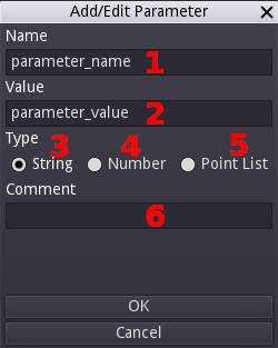
- Name - Name of the parameter. It must not be the same as an existing parameter, cannot start with a number, and can contain only numbers, letters, and the underscore character. These rules exist so that the parameter name can be used as a variable name in the CadQuery script.
- Value - Sets the value of this parameter. It can be text/string, number, or a point list. This field does support equations for the Number which can reference other (already existing) parameters.
- String - Select this to specify that the parameter is to be a string (text) parameter.
- Number - Select this to specify that the parameter is to be an integer (i.e. 1) or a float (i.e. 1.0).
- Point list - Select this to specify a list of XYZ points, which are used for things like polylines and splines. Selecting this will replace the Value field (#5) with a table control that allows setting the points. Right clicking on the table will display a menu that will allow the user to Add or Remove points from the table. Remove will delete the currently selected row. The points in the table can be edited directly, as with a spreadsheet application.
- Comment - Description of the parameter that will travel with the component file. Use this to inform end users why the parameter exists and what it is used for.
Once the parameter information has been entered, clicking the OK button will add the parameter to the Parameters list in the main user interface.
Operations Dialog
Right clicking anywhere on the 3D view will display the Operations dialog. This dialog can also be displayed by right clicking on the Components tree and then clicking the Add button. This is where the majority of the work of creating a component is done. Displaying the dialog on a right click within the 3D view gives fast access to component creation operations, and prepares the user for selecting features such as vertices, edges and faces to be used in an operation. There are four group buttons at the top of the dialog, which select groups of operations that this dialog can operate with. The diagram below highlights each button and which group of operations it selects.
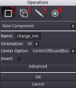
- Component/Workplane - Used to create a new components (which is a CadQuery Workplane object underneath), add a construction workplane, or modify the existing component's workplane with operations such as
rotateandtranslate. - 3D - Collection of 3D operations, typically used with a previous 2D operation to create or modify a component.
- 2D - Collection of 2D operations that can be used alone, or in conjunction with a 3D operation later.
- Selectors - Selectors are very important in both CadQuery and Semblage, and are used to select faces, edges and vertices in a way that captures design intent and makes designs more robust in most cases.
Common Controls
Besides the mode buttons, there are a few controls that are always available on the operations dialog. Those controls are outlined below.
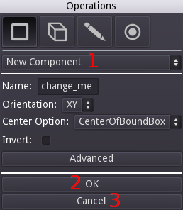
- Operations Drop Down - Allows the user to select which operation to apply to the component next. By default, the operation that is shown when creating the first new component is New Component, which must be created in order to apply any other operations. Changing this drop down will change which controls are displayed in the middle section of the dialog, above the OK and Cancel buttons.
- OK Button - Once all control values for the selected operation have been set, clicking this button will close the dialog and add the operation under the currently selected component in the Components tree. It will then trigger a render of the resulting component.
- Cancel Button - Can be used if it is decided that an operation should not be applied to the component.
Sketch Controls
When in 2D mode, two controls will be added to the dialog. These extra controls allow the user to group related 2D operations together into a single sketch operation entry. At some point this manual addition of 2D operations will be reworked into a mouse-driven sketch tool with 2D constraints. The sketch controls are outlined below.
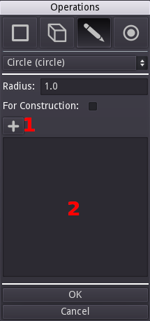
- Add Button - Clicking this button adds the currently selected operation, configured with the current settings, to the operations list that is discussed next.
- Operations List - This holds each of the 2D operations that have been added by the user. Double-clicking on an entry will load its information into the controls above so that it can be edited (editing is discussed in an upcoming section).
Once a 2D operation has been added to the operations list and is selected, a set of new buttons becomes available which allow the user to modify the sketch operations and their order. Each of those additional buttons are outlined below.
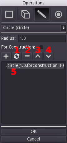
- Re-Render (arrow circle) - After changing the order of 2D operations, clicking this will refresh the operations and their order.
- Remove (minus) - Clicking this will remove the currently selected 2D sketch operation.
- Move Up (up arrow) - Moves the selected 2D sketch operation up towards the top of the list.
- Move Down (down arrow) - Moves the selected 2D sketch operation down towards the bottom of the list.
- Selected - Example of a 2D sketch operation highlighted after being selected.
Mouse Controls
Mouse controls are not configurable at this time, but likely will be in the future.
- Left Mouse Button - Rotate the camera around the component in the 3D view.
- Mouse Wheel - Zoom in and out.
- Middle Mouse Button - Pan the component side to side.
- Right Mouse Button - Open the Operations dialog.
Workflow
Semblage is designed to use the following general process for creating components.
- Create a component
- Create a 2D sketch on the component's base workplane (i.e. lines, arcs)
- Perform a 3D operation on the 2D sketch (i.e. extrude)
There are variations on this theme, such as when a user only wants to create a 2D sketch to export it to DXF or SVG, or when the user wants to create sketches in two orthogonal component workplanes to do a sweep operation. In general however, this will be the central workflow for most uses.
Now that you are familiar with the user interface and basic usage of Sembalge, the Tutorials are useful for learning the workflow and modelling techniques in more depth.